Graphic Design Basics Free Course
If you are interested in graphic design as a profession, welcome to this Graphic Design Basics course that covers all the basic concepts to help you get started.
Graphic Design Basics course
To start, let us define graphic design.
“Graphic design is making visual substances with the intent to communicate. This is what distinguishes design from art.'”
Graphic designers combine visuals such as photos, text, logos, and complicated layouts to provide a concept or an idea. The relevance of graphic design is that besides creating an excellent visual aspect, it also restructures intricate information to be presented in the most understandable manner possible.
The History of Graphic Design
Before we start with the course, let’s take a quick look at the history of graphic design. Here’s a basic timeline:
-
It was during the Upper Paleolithic, around 38,000 BC when humans came up with cave paintings, which is in fact the earliest form of visual communication.”
-
Next, in around, 3000BC, the Sumerians wrote for the first time languages with the intent to write about trade and catalogs. The first few was ludemark logographic, which means that they put icon into representation of a word or an entire concept.
-
Then, in the year 200 AD, the people from China did printing on cloth, silk, and even paper using wood reliefs.
-
In 1040, China created the first ever movable type printing press that was made up of porcelain.
-
Moving forward into around the year of 1455, Johannes Gutenberg invented the movable type along with the printing press whereby he made a copy of the Bible. The book could now be mass produced.
-
The industrial revolution which took place during the years 1760-1840 resulted into a lot more efficient ways of printing due to lithography and later on Scotch lithography.
-
During the last few decades of the 20th century, typographic elements contributed greatly, thanks to scientific advancements, posters billboards and newspaper advertisements. Between these years there were plenty of artistic movements, that appeared and had a strong impact on design, for example, Bauhaus, Swiss design.
-
Last but not least, the introduction of the computer, social media platforms such as Photoshop and the net indeed opened a whole range of disciplines such as the designing of websites, interactive designing, UI, UX, product digital design and a large number of other designs.
Design Theory & Principles
All the design works are based on the fundamental design principles and they include:
the only the colours that are necessary for the design
the most suitable font
the best arrangement of text
At this point we will break down design principles including color theory, appropriate terminology and the composition of typography among others. But first let us establish what the graphic designer is supposed to do. An American designer, William Addison Dwiggins published an article in 1922 entitled “A New Kind of Printing Calls for New Design.” In this article he outlined in detail what was expected of him:
We can leverage logos, brand systems, layouts, design artifacts, collateral, and so on to communicate. However, justification to all this let a brand, book or any entity structure and make sense of information, narrate and eventually engage people in a meaningful manner.
Basic Design Principles
Laid out design guidelines and principles provide the designer with some organized rules through which a composition can be done and the outcome is visually appealing. The aim of these rules is to ensure that a message is communicated in the most orderly and useful manner. So let’s go through each of these principles.
Balance
Every single element added on a page has a visual weight which approximately relates to how form, size, color, and texture are rendered. To ensure that a design is felt to be stable or possesses some sense of balance, proportional scaling of the elements is appropriate. A design which lacks balance would be more appealing to one side and less appealing to its opposite.
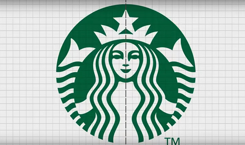
There are two types of balance: one is symmetrical and the second one is asymmetrical. In symmetrical balance, there is even weight on the left and right in regards to the visual elements of that page. Meanwhile, asymmetrical designs have different elements on the left and the right, but those are equal in terms of the visual weight.

Graphic Design Basics Free Course Unity
Unity is the harmonious completion that all the elements within the final design possess. Achieving color that is similar and congruous and using elements in a cohesive manner makes the elements appear as though they belong together. Structural unity can be accomplished by establishing clearly defined relationships between the visual elements.
Without unity your design will seem congested and chaotic. More importantly, though, audiences will tend to focus on the wrong characteristic of the design and fail to grasp a distinct meaning.


Contrast
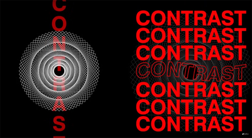
Contrast is the measure of variation between design components within the composition so as to make hierarchy. The variety makes certain elements more prominent than others and this can be achieved using colors, textures, sizes or shapes. Apart from this, contrast can also be used to create an emphasis on a detail, allowing the most viewers to see certain elements.
Repetition
The repetition of similar elements in the layout might be quite appealing to a user. Repetition is the use of one single item throughout the design. A grid may be called a repetition of lines, for it ensures some degree of uniformity. Repetition may also be realized over the use of several elements of a design say a logo or a tagline in a branding project.

Pattern
A pattern refers to a repetition of more than one design features. While repetition of a design uses a single focus element or image, pattern applies multiple images or a series of pictures and uses them throughout the design like wall paper and background.
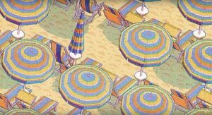
Rhythm
Rhythm can be described as the visual speed of a collection of the same elements that have been used several times but which has variations. It gives the effect of ordered motion. Rhythm is an design principle that is mostly embedded in the works of art, and thus does not come out very visibly in the design.

Movement
This is the direction in which the viewers’ eyes are guided within a layout. Movement in a layout makes the play more interesting and dynamic and makes sure the viewer is kept focused. It may be achieved with rhythm in the case where an element is used in different ways over and over again throughout the creation.
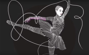
Emphasis
Emphasis is intended to help the viewer focus on a particular detail in the design or its construction. This could be a button, a website, an image, etc. The point is to make something that will not blot into the rest of the page.’

Proportion
In terms of design and art, proportion is the scale or ratio of an entire compositional piece. For example, if the header is larger than the caption of an image, then the colossal header requires a proportional relationship between those two elements. In layout hierarchy, of such captions, the proportion of one of them to a given photograph descriptive statement or caption ought to be bigger because a headline is so much larger than the other less significant elements.

Harmony
For most artists, harmony is the directing principle concept, detailed examples would just distort that. But as a rough guide, simply think of it as balance between elements in a composition. The elements have to be similar in some aspects, not completely lacking similarity or completely identical. Through the use of color palettes or similar textures, a sense of togetherness can be achieved amongst diverse elements.
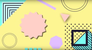
Emphasis
Tension in design is a key influencing factor, especially in the elements and principles of design as described by numerous theorists and practitioners. Artists make variety of shapes to add interest on their designs and this can be achieved by manipulating the geometric shapes.
“One of the principles that assists in achieving a successful composition is the elements of art. Applying it together with the elements assures that every single part of a design is functional which in turn helps the designer accomplish the goal of the design.”
Variety in Color
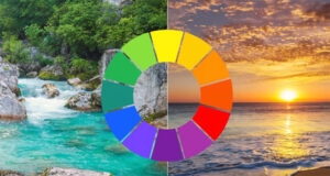
The blending of colors is two main aspects. The importance of color and color mixing differs in artists and designers from different schools. The color wheel is a device that expands the concept of color.
The three color wheels – primary red more than yellow which is moreover blue, constitutes the bases of five more resulting colors, orange, purple and green, together with yellow-green, blue-green and blue-violet.
The color wheel can as well be divided into two primary temperature groups. Cool colors include blue green, blue violet, yellow olive, and yellows while warm colors include blue, green, orange, red, yellow orange and crimson red.
Color wheel
Profiles/Spaces of Color
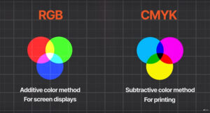
As a graphic designer, of a print and even digital design, one must understand what color profiles or color spaces are. Such knowledge is beneficial, and it is based on the Project’s end goal. RGB and CMYK are twoalternative color profiles which are meant to serve different mediums:
RBG OR CMYK
When designing a document in CMYK on-screen computer designs, it is apparent that the bright colors will be visible on the screen. For screens however, the vibrant colors used always appear the same when the document is being printed out.
Color Diversity
Below are the definitions provided with the terms when dealing with color diversity:
Hue is any primary component found in the color wheel. A different term for color.
Saturation describes the magnitude of a color or how pure it is.
Value refers how dark or light a particular color is.
A shade refers to a darker hue which has had some black added.
A tint refers to a hue that has white in it, thus diluted.
A tone has black or white or gray added to it in color meaning.
Так выконуються функцiї покрiвельних конструкцiй
Let’s look at several important color relationships that can help you start developing your own color scheme.
Complementary color harmony is based on a pair of colors lying on opposite ends of the color wheel, such as red and green or blue and yellow. This combination helps to create an extremely strong contrast.
Split Complementary color harmony is based on 1 primary color and 2 secondary colors, which helps to promote the base color. Instead of complementary color, which is placed on the axis, two other color, themselves out of the base color, out of the color wheel are used around the base.
The center color, in the case of analogous color harmony, is combined with colors that are one or two steps away on the color wheel. This color scheme is one of the simplest to use as it has low effectiveness in creating contrast – therefore is good for producing calm energy.
Monochromatic color scheme utilizes one specific color from the color wheel and employs its shades, tones, and tinges to create a color wheel, it has a neat and simple appearance.
Triadic color harmony employs the use of three colors that are uniformly spaced around the color wheel which forms a triangle.
Tetradic colors can be visually described as two complementary colors and the other is the split. These color mixes can work Great when one of two colors dominates the color palette, while the other serves as the highlighted color.
Color Psychology
It is a very strong weapon to use in graphic designing. A color has the power to change how a consumer will perceive a particular brand and the feelings that they experience. Just as warm hues are related to solar sources and cool shades are related to peaceful calmness, the rest of the colors on the color wheel also affect perception and behavior.

There are many factors to keep in mind such as the cultural background, the gender, the age and many others since colors can be perceived in many ways. But here are some general positive and negative associations of different colors.

Color Positive Associations Negative Associations
Red Passion, Power, Excitement Anger, Danger, Aggression
Blue
Green
Security, Serenity, Trust
Prosperity, Health, Hope
Coldness, Emotionless, Unfriendliness
Boredom, Stagnation
Typography
What is typography ?
Typography is concerned in making written language available by the design and arrangement of type logically readable and visually pleasing.
Type Anatomy
- First, let us discuss some of the basic expressions in type anatomy.
- Serifs are the small feet at the end of a stroke on a letter or a character. Serifs are mostly added for long body copy for they are quite easy to read.
- An ascender can be defied as such for any lowercase part of the letter that is positioned above the x height. For instance, the letters; b, d or h.
- The same go for the descender, this term will refer to the lowercase parts of the letters that go beneath the baseline, that is, letters like, g, j, p or q.
- The position of stroke in letter form is called ear, and some authors take portions of letterforms to interpret them, for instance how they would appear when drawn using a pen.
In most fonts, ascenders appear in rounded portions of character such as lowercase letter b, or d, and, o, uppercase D, and B and are referred to as the bowl.
Another instance is the shoulder which is the round portion of a dominated letter like r, m, or n, and the purpose of that name is because it resembles a human body part.
The main vertical stroke or the high stroke as it has been referred to in the an alternative of stem and head, of a letter is defined as a single striking line on a shaped letter.
In most cases, it depends on the font type, but for stem, it is the opposite as the spine is more positioned left to right or slants towards the bottom row with a slight term stroke on the uppercase to lowercase letters.
Ligatures are special symbols which are a combination of two different symbols. Occasionally, certain letters, when printed, may join with one another, hence ligatures are there to make the join more natural.
Lowercase means the smaller letters of a typeface.
Uppercase means the capital letters of a typeface. The word was derived from the age of metal type. Capital letters were stored in the upper section of the type case.
Font style is the way a character or case is set, for example italicised or all capital.
Weight describes the thickness of a typeface with regard to a certain font, stroke. Two of the more common weights are regular and bold, but weights can range from the very lightest to the very heaviest.
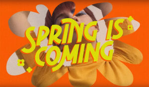
Type Classification
If you want to recognize changing typeface, it is helpful to be aware of different typeface categories. The major ones include:
Sans Serif: Sans serif fonts are fonts that do not have serifs. Sans serif fonts are the most versatile category of typefaces. They can be utilized as display or long form copy fonts.
Grotesque Sans Serif: This type of font came in commercial use in the 1900s. It has weak thick and thin strokes contrast and some characters have an open aperture.
The Neo-Grotesque Sans Serifs are the later refinements that developed later on and that were meant to be more neutral and readable. They have a single uniform and closed aperture gap.
The shape of Humanist Sans Serifs is based on the Roman style of the capital and has some letters that are influenced by handwriting. These have a relatively high contrast of strokes and wide aperture.
Geometric outlines of the bowls of a sans serif font are more likely rounded while their proportions tend towards rectangle. They lack stroke contrast but are rather regularised and have a moderate vertical axis.
Serif Fonts: The serif fonts are those that bear serifs. A serif can be defined as the little feet that are found at the end of a stroke on a character. Although serifs are classified as body type, they are not hard to find since they provide great support to the eyes.
The Old Style Serifs sees its development during the 15th and 18th century to be a bit easier for using as metal type for early printing. It includes a type of serifs that are slightly rounded and cup inclined.
The Transitional Serifs can be said to have emerged in the 18th century as some form of a transition between old style fonts and so called modern fonts. The main feature here is that serifs have been identified as being sharper as well.
New technologies had an impact on the Serif category, which gradually began to develop into a more polished form. The epigraphs are entirely flat and straight, and at times making them seem illegible, yet chic.
Slab Serifs can be distinguished from other serif sub-categories. The serifs are broad and rectangular, and because they are cut out in uniform thickness of strokes there is uniformity in their construction. Such typefaces were employed for advertisement purposes back in the early nineteenth century.
The Russian style of the script comes from cursive signs, including its two forms, which are formal and casual in style.
The late 17th and late 18th century serves as a source for Formal Script Fonts which are decorative as they contain tails and flourishes. It is also known that these fonts are used on ceremonial occasions and for diplomas in award giving as these types are elegant in nature.
Casual Script Fonts are brush stroke variants of the 20th century. In contrast to the formal scripts they are far more cordial and easy going in regard to the formality.
Monospaced Typefaces denotes fixed width as such space entirely consumes the same volume horizontally. These fonts bring to mind typewriters in computer programming.
The advertisement settings fonts stand out and do not fit into the other categories that have been described. They are, in fact, among the most numerous and most heterogeneous. They do not make sense in the context of the best typesetting and are frequently radical.
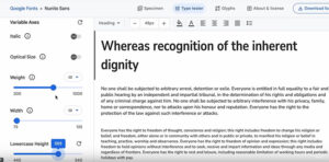
On the other hand, Variable Fonts are not a type of typeface per se, but a format file. A new technology known as OTF Variations is part of this OpenType format jointly developed by Google, Apple, Microsoft and Adobe. Within a variable font, the font can have all possible character appearances or up to 64000 variations, including thickness, boldness, and title case.
premium font example
Envato Elements will show you a complete font library that explains why premium fonts exist to allow you design stunning logos.
Typesetting Basics
It is always mandatory that one should always look at legibility and visibility in a design. The focus in graphic designs is to present and synthesise information in a visually pleasing manner. On the other hand, typesetting is one way of making a design piece neater and easier to look at. Not many designers pay such attention to these details but when they do, it is very telling. Here are the basics of typesetting:
Legibility: Presents how a particular type of text is placed in the area of focus, usually meant to be pages. This is the combination of selection of fonts and collocation of words to aid written discourse to flow smoothly and be easy to read.
In order to view obviously different characters from other characters, a measure of legibility is rendered. Distinction of one type from another is what is meant by a legible font. As legibility contributes a lot to the overall design of a document, it can definitive if a font will be usable or not by considering specific factors such as x-height, character, width and weight.
Since the target group of children or elderly people are included, the more small the type size is, the harder it becomes to read. You need to have an idea of who you are designing the content for as this is particularly important.
A good practice should be to keep the ideal line length to be within 45-70 characters. If the column is too narrow it will refine less than 45 words which might lead to a lot of words being hyphenated and the reader jumping lines frequently. On the contrary, overpowering the column width would result in the same issues, but in this case, the word would hyphenate while reading to the next column.
Entirely depends on the x-height and font that you are using, the amount of leading that you will require in text will change. Having proper line spacing makes sure that the text is easily readable making it unlikely that the lines overlap and creates confusion for the reader.
Tracking (or letter spacing): This refers to the distance between letters that comprise a single line. Its adjustment is done to improve the ability to read within the text.
Kerning is the adjustment to the spacing between two specific characters of a word. It is used on logos and headings where such adjustments are needed to improve legibility.
Alignment: With regards to alignments of paragraphs in Western text, it can be the mental lines along which a block of type is visually aligned. Left alignment allows all new content to start at the same horizontal point on the plane. Left alignment isn’t so commonly employed as an approach and center alignment should only be for one sentence text.
Rags: These are various patterns that may occur when a paragraph is left or right aligned in terms of uneven vertical edges. You can remove them by breaking up parts of words that are divided at the end of the line or by soft return a new line.
Rivers: Define the areas on the bottom of some paragraphs that are left undisturbed whereby the effect looks like an upside down river, which is only mostly seen when working with justified paragraphs. This problem is mostly remedied by changing the justification on the text or operating to set every sentence with a hyphen and soft return manually.
Opposed Elements: The term “orphan” describes a disjointed opening paragraph which consists of the last line and sits at the top of a page/column, and the term “widow” relates to that only a sentence or operative word remains hanging at the last of a paragraph or a significant portion of a text and is set apart from the rest. These two problems can be solved through kerning adjustment, tracking adjustment, or even manual line breaks.
Font Style: Uppercase translation occurs when each letter in the sentence is written in capital letters. Lowercase translation preserves all letters without capitalization. Sentence case denotes only the first word of the sequence in focus being capitalized. Title case on the other hand implies all the important words begin with a capital letter.
Design Theory in Practice
That sounds like it was a bunch of graphic design theory. Now let’s make it more practical and see what graphic design really means. The next few sections will cover design examples, related to those concepts we dealt with in the previous chapters.
You will be able to comprehend that there are brief problems, messages, and certain users to be targeted and based upon the target users, and this is important because it guides the different design options you have to make. I should also mention, however, that there is a brief to work off, which is to say, there is a design solution that needs to be achieved, a message to be communicated, and a user whom we are designing for.
The major focus of Print Design
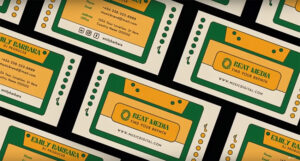
So print design encompasses basically any design where the final form is envisaged to be in printed. Agreed with me, however, that due to the advent of numerous digital tools, a computer is most will be used to create a template only for printing in the end. This includes things like brochures, shopping bags, stickers, labels, book covers, posters, business cards, flyers, and magazines. Here are some examples:


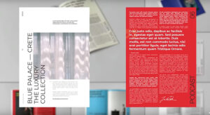
Technical Aspects of Digital Product Design
On the contrary, digital product design concerns itself with the design of a software application, a website, or platform. This process encompasses UI and UX designs. First comes the exploration of user experience- that falls under ux design. Secondly ui designers do the same only in a more organized way where they ensure that the final product has a good user interface.
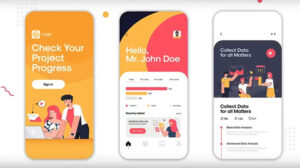


In the preceding design screens of the app, there is a uniform feeling combined with a few aspects. The app for instance contains a dull color and an emphasis such as a specific action button not being too hard to spot, and they have great levels of tunic abstraction through the typography. And there is also a clear transition in terms of the illustration from one screen to the next.
Digital Design
Digital design includes creating elements intended for viewing on a computer screen such as thumbnails or a series of banner advertisements. It can also sometimes include motion such as animation, simple modeling and even multi-angled interactive pages.
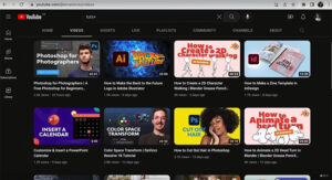
In the example below, the designers have created thumbnail sketches for YouTube vividly, interestingly and even enthralling in a split of a second. The fonts are readable, the designs are quite simplistic due to the small measurement of the thumbnail and they incorporate exciting hues and compositions to grab the attention.
designs for different youtube channels
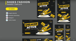
While browsing the below mentioned banners, there are quite a number of sizes, but all have similar elements. The shoes are more visible with aid from dark background colors and light typography. Even the sans serif has the effect of creating some sort of urgency, more pronounced when written in all caps. You would come across this type of a banner while roughly scrolling through a website, hence the design of the banner is critical – it must be visually appealing with features and text that are easy to spot and with a very powerful image.
Brand Development
Let’s pause and focus on brand development. It incorporates elements such as graphic design, web design, and product design. Hence, what is brand development?
“The core objectives of the brand’s design, according to Hammer, were the distinctive features of the trademarks of a logo, color palette, font use, term sheet, among others, and the aim was for the brand to be clearly differentiated from other brands and distinctly owned by the consumer.”
Having an effective branding ensures that when consumers look at all of the attributes associated with a brand, they comprehend the company’s history, mission, values and beliefs. Below is a depiction of the branding process I used and it’s based on the branding of a coffee company that I was working with.
I began by knowing what motivated the owner to launch such a brand, their background, likes, and dislikes. I also inquired about the demographics of the intended audience: the age and profile characteristics of people who are basically likely to consume this type of coffee.
On the basis of that interaction, I elaborated on the brand strategy the presentation was supposed to serve. I explained the nature of the brand, the brand’s target audience, semantic keys for the brand, and how the brand stands out from other brands.
To communicate all of this to the client, I made moodboarding, emphasizing particular characteristics like its emphasis on less known coffee regions center, in particular women cattle.
Basing on the particular characteristics of the company, a color swatch was also developed in broad terms based upon the existing knowledge of the company. Together with that, I suggested some nice and safe combinations and some daring ones that the holder could use in branding.
Going forward, I prepared two concepts to showcase to the client. I always recommend only one or two concepts to be presented. This way, it is possible to concentrate on the finesse of the conceptualisation Moving forwards we developed a very structured manners of asking pertinent questions during the first conversation.
As the next step, I collected all the comments and, as a result, improved the selected idea. In this timing, this is a good time to check if the design works in print or digital and implement changes if there are gaps.
Construction of a final pack for the client was the next step.
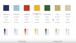
I also established brand guidelines after the project approval so that the owner can apply the design consistently. You can see some example pages from this document below.
Design Tools
In this chapter, the focus will be on the various design tools which can be used and created in order to maximize efficiency. A structured design approach enables a designer to produce and complete quality work in an orderly way.
Thus, in this same section, we will check out other useful tools that would enable you enhance your projects at different points in the design cycle. We will address tools that allow easier project management, creation of moodboards and color palettes, and we will also explore the assets of projects and their usefulness.
Design Workflow
First, let’s discuss the different design disciplines. Graphic design is an activity aimed at creating visual compositions in order to solve problems and communicate ideas by means of design elements including typography, imagery, color and form. There’s no one recipe to do that which explains why there are several disciplines. Here’s an overview:
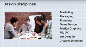
design disciplines
Even though there are various disciplines, most of these tasks have more or less the same workflow:
Usually, we begin with a design brief which has been handed over to us by the client or a creative director which gives us the specifics, aims and objectives of the particular assignment.
The subsequent stage is the brainstorming stage where all the material gathered from the research is iterated to come up with the best possible wide-ranging solutions to the problem.
Once the brainstorming phase is completed, we should have many solutions and concepts but now we need to focus on the best ones and consolidate our solutions ending up with not more than three concepts or two concepts or one is even better.
At this point in time, rough sketches or drafts are made which are to be shown to the client or the team. The presentation must be able to convey the message as briefly as possible as a telegraphic outline. Bear in mind that, usually, clients are not designers, so most of the time, it will be necessary to explain each concept in details, especially the reasons why certain decisions were made.
Feedback is provided by clients. Preferably this feedback will be broader than ‘In my opinion this is good or this is not good’ and will be more broad in terms of concepts.
The subsequent step would be to take into account the feedback from the client, integrate the comments into the design, finalize the details, show the end result and deliver all necessary files. In case there is a need to send it to the printer, you will need a PDF document, or you will need to make it live in case it’s a webpage.
The designers’ toolbox consists of the following programs:
Adobe InDesign can be beneficial to the design of magazines, books, or in the publishing of multi-page documents.
The Adobe Photoshop is useful in works involving digital painting and in photography.
Adobe Lightroom is more specific for photography.
Adobe Illustrator enables the creation of vector-based graphics, illustrations and logos.
Adobe Premier Pro is appropriate for video creations.
Adobe After Effects serves to create motion pictures.
Figma serves to provide teams with the web-app to work on interface with wireframes.
Canva is an easy to use application that allows one to design marketing materials such as images, videos, and social media promotional graphics or advertisements, brochures, and posters.
Affinity Designer is an equally good substitute to Illustrator as are Sketch, CorelDRAW and Inkscape, among other app alternatives.
Affinity Publisher is just like InDesign but also allows one to work directly on InDesign projects.
Adobe XD and Sketch are good alternatives for UI/UX applications.
FontLab is the industry-leading font creator software that many professionals use, and it’s also easy to find free alternatives such as FontForge.
Trello can be of help when working on design projects to a group.
Milanote is a fantastic, easy-to-use app that allows people to prepare and arrange their ideas and projects in the form of visual boards.
Color & Design Assets
Design assets have become an important companion for the busy and budget customizing designer. A few design asset useful sources are:
DaFont well library which has a good stock of fonts that can be used for multiple projects.
Google Fonts is a great like and high quality reliable free fonts with a vast number of open source fonts for you to sample and download.
Coolors How do I create a color palette? It is a good question very easy to answer, You can select colors, get inspiration, generate random colors, and check their contrast and much more.
Happy Hues is another great tool for colors, you may like a particular color palette but don’t know how to use it, a site like this will assist you with ideas and illustrative examples of when and where to use the color palettes.
Envato Elements allows you to showcase the best vintage fonts, futuristic fonts, and even some of the industry-leading experimental fonts. It also functions like a graphic toolbox with a vast range of useful graphics, templates, add-ons and more.
Technology & AI,
Now let’s discuss how the advancement of technology has shaped the graphic design industry.
What stands out first and foremost to a layman who comes across a graphic designer would be that such individuals have something to say and are able to say it with creativity and intelligence. With the aid of the internet, nearly every person on the planet can communicate and share knowledge faster than ever. Here are some of the transformations that graphic design underwent because of technology:
Businesses are better able to promote themselves on the internet and engage directly with customers.
The quality of traditional graphics has significantly upgraded – what was previously done via collage work could now easily be painted in adobe, or even AI could be used to generate words instead.
Most modern smartphones come with quite powerful cameras which take spectacular images, so it is easy for anyone to capture beautiful images regardless of being professional photographer or not.
Now, many designers can work from anywhere thanks to technology.
Thanks to technology, the scope of work of graphic designers has expanded since many fields began to overlap. The internet’s shift put UI and UX to fruition. The standard responsibilities of a graphical designer revolved only around designing packaging or advertising intended for businesses. It has now progressed into numerous categories but with communication and technology as the base of it all.
Taking into consideration fonts, we no longer need a multitude of font files, we can now make use of variable fonts which serves multiple purposes, a single file possesses different typographic styles in terms of weight, style, and size.
plantilla de fuentes
Since I believe that graphic design has a point I would like to emphasize it here.
“Graphic design is about problem solving and being creative, which basically means that every design has a purpose”.
Conclusion
At long last, let us review and summarize what you have been able to apprefind and understand from the course within the graphical design context. Designing is the process of which visual content is made in accordance to the purpose of the message to be transmitted. You were told of the various visual constituents that go into designing. We considered the fundamental concepts of the organization of page elements. We discussed the color theory ideas and its application, and we reviewed briefly the typography, concept and its development.
At least, sub-disciplines of graphic design were also analyzed as well as a few of those practiced in the middle ages. You also observed pictures of the time that depict the various aspects of the desired style to be applied. I also pointed out some tools that could be useful in order to keep control of your tools and smooth your workflow.
At last, we also observed how technologies have gone up and progressed in our industry. While we have witnessed rapid advancements in technology, it is important to focus on the actual work of a graphic designer. It is all about the ability to create a decorative object and at the same time to structure and convey a large amount of complex content. So, the ultimatum at the end is to communicate in the most clear manner.
